

Sackcloth and Ashes | Website Redesign
Redesigning the digital experience for a mission-driven brand to increase conversions while authentically communicating social impact.
Team
Sr. Product Designer
Role
Jr. Product Designer
Scope
Website redesign, shopping experience optimization, brand alignment
Tools
Figma, Shopify, Adobe Suite, HTML/CSS
Overview
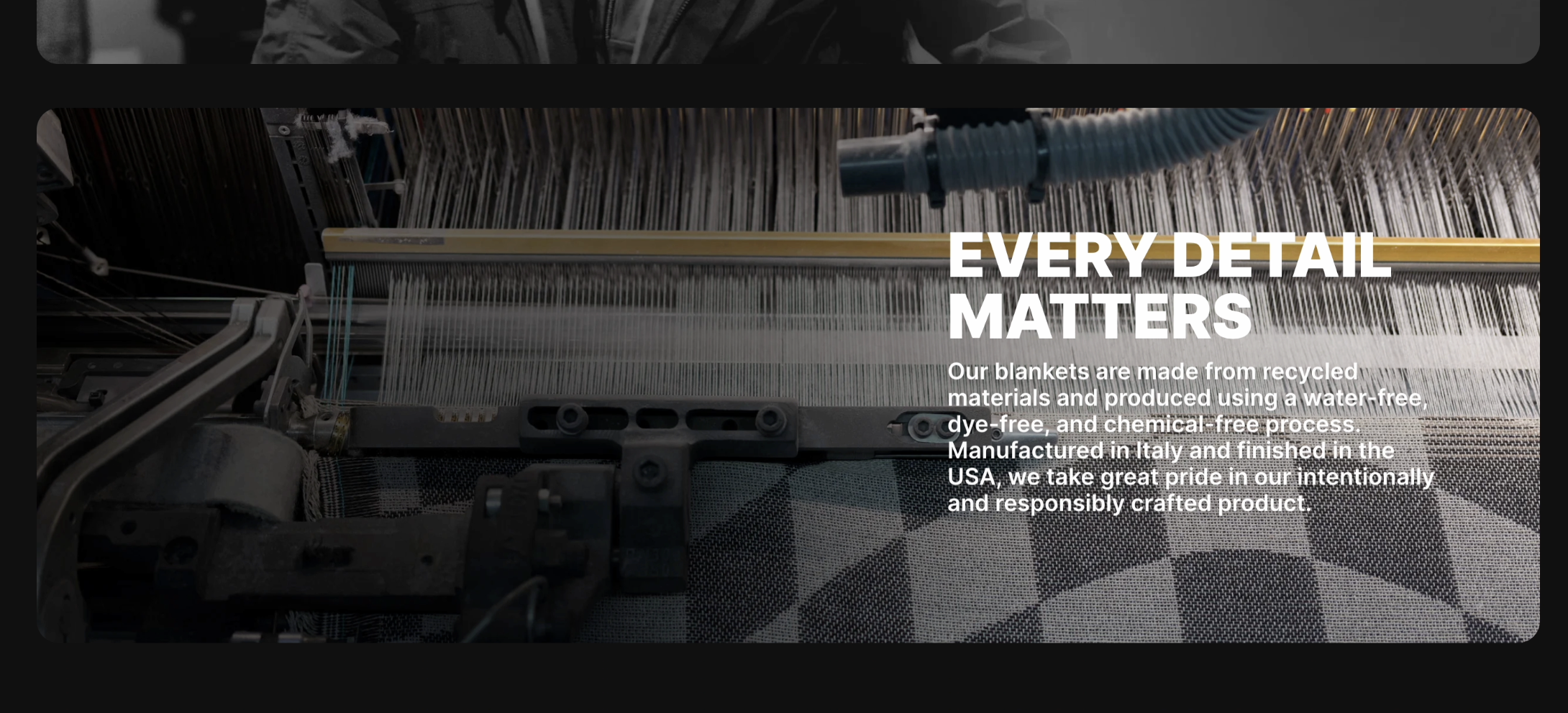
Sackcloth & Ashes is a social enterprise that donates a blanket to a homeless shelter for every blanket purchased. As the brand scaled, its digital presence needed to evolve to support both mission storytelling and commerce—two objectives that often compete for attention and hierarchy.
Led the visual rebrand and site redesign to modernize the e-commerce experience and unify the brand across the platform. Worked collaboratively with the lead designer and engineering to implement design and front-end updates.
Problem
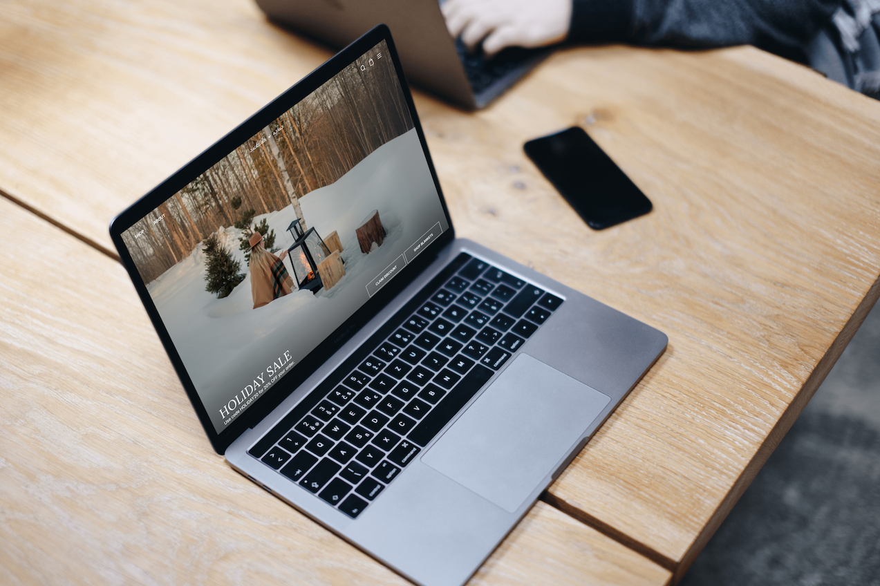
The existing site suffered from high bounce rates (68%), low conversion (1.2%), and fragmented user journeys. Analytics showed 73% mobile traffic, but the experience wasn't optimized for mobile-first browsing or purchasing. The interface and experience did not effectively align with the company’s predominantly female audience. The mission narrative—the brand's primary differentiator—was buried below the fold.
Pain Points:
Navigation & hierarchy challenges
Users struggled to find products and understand the one-for-one impact model
Conversion friction
Product pages lacked clarity, trust signals, and connection to mission
UI did not align with the primary users
Mobile experience gaps
Majority traffic on mobile but UI patterns were desktop-centric
Design Solutions
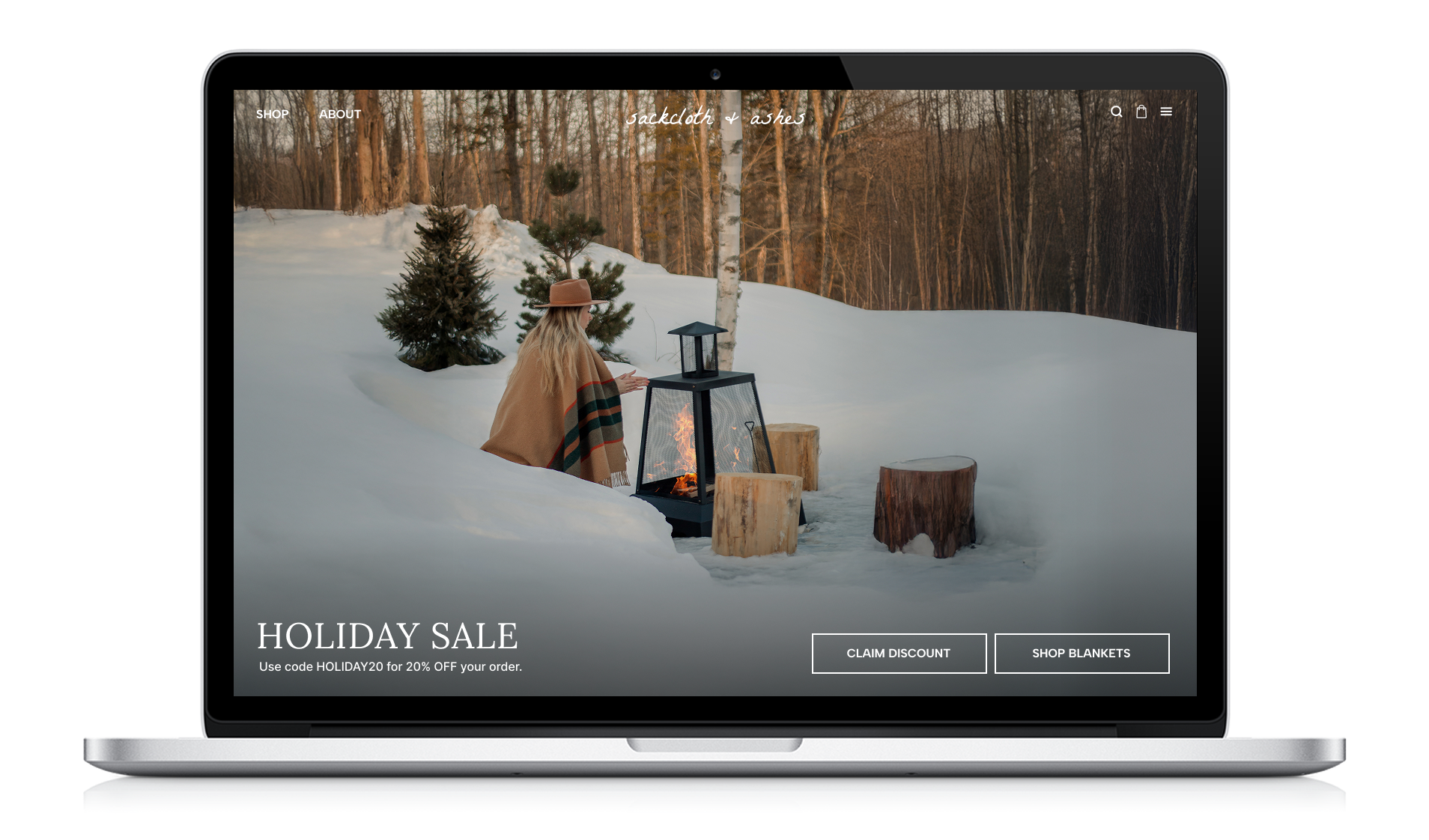
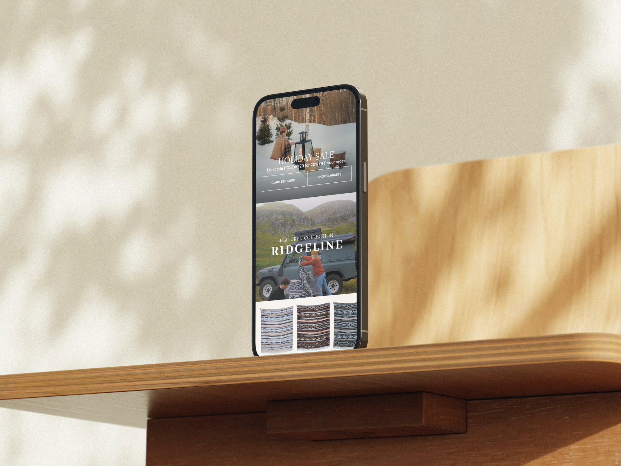
A. Rebrand and Redesign of Homepage
Redesigned homepage to introduce a refreshed brand direction, creating a cohesive visual foundation for the entire website
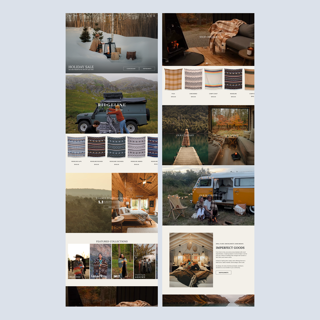
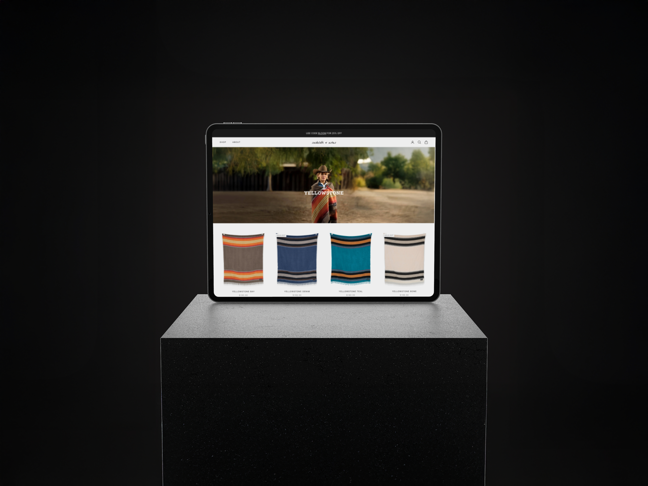
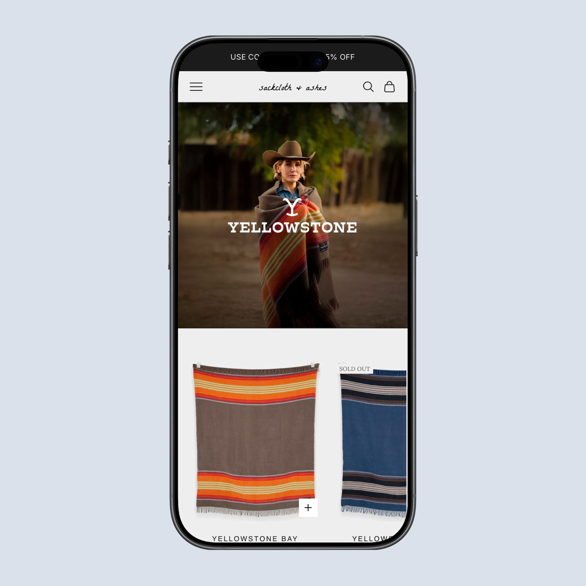
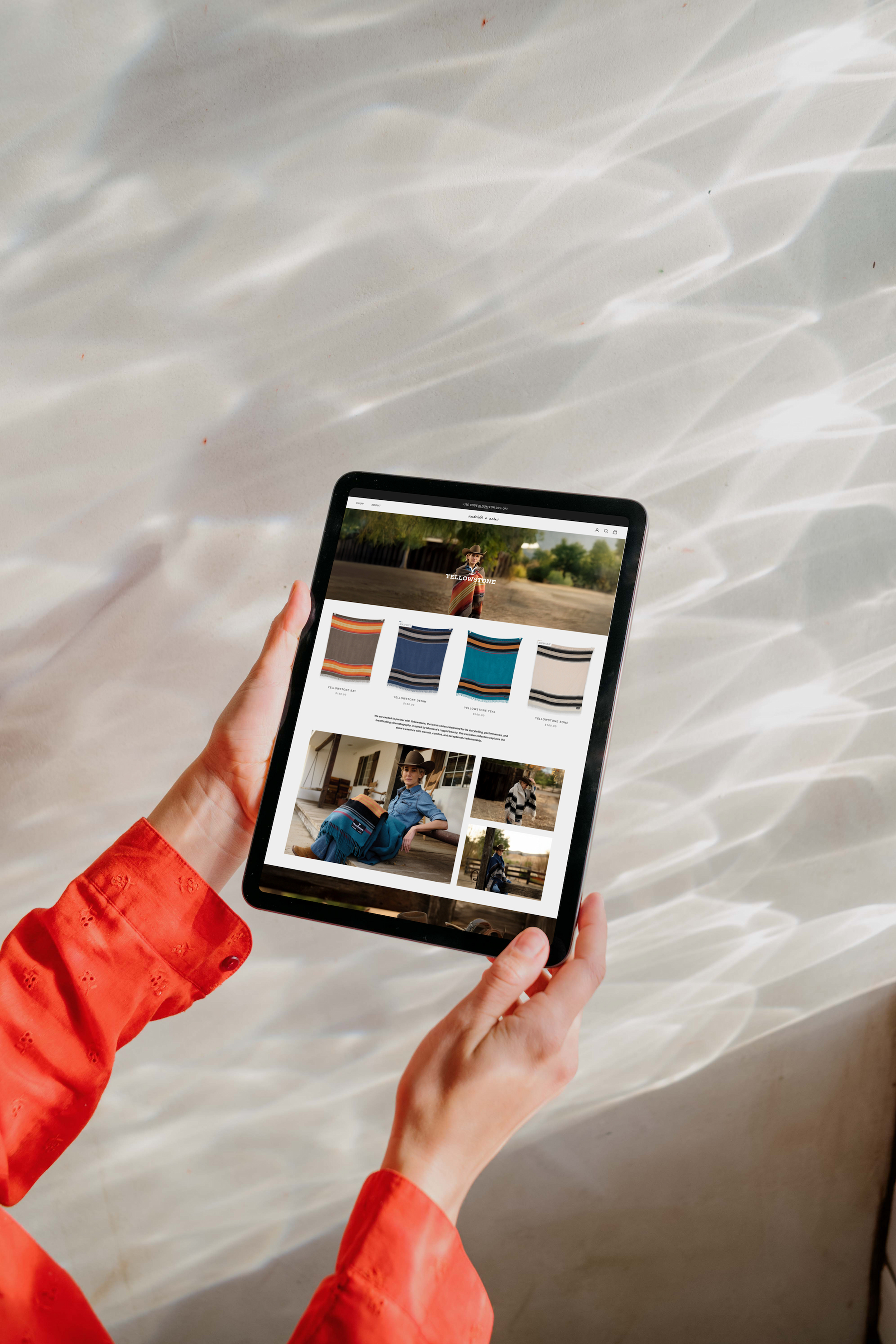
B. Collection-Based Landing Pages
Designed individual landing pages for each blanket collection
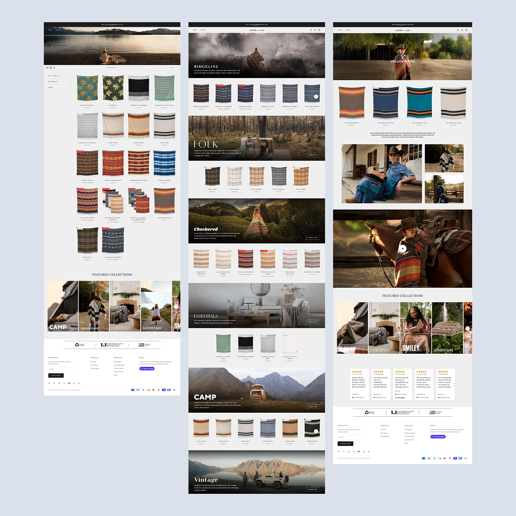
C. “Shop All” Filtering System
Reorganized filtering categories to improve navigation and usability
Reorganized layout to support faster product discovery
D. Creative Flow & Cohesive Experience
Established a consistent creative flow across the entire website
Ensured each page connected seamlessly within the overall user journey
Balanced visual storytelling with functional UX
Before
After
Impact
Improved product discoverability and navigation
Transformed the experience from a generic product grid into a curated, story-driven journey
Created a more cohesive, intentional, end-to-end user experience
Strengthened brand storytelling through structured browsing
Designed UI design system and established design-to-development workflow and handoff documentation supporting ongoing design system adoption
The design system approach allowed the platform to scale beyond the initial redesign—supporting seasonal campaigns, new product categories, and expanded impact storytelling while maintaining visual and interaction consistency across all touchpoints.
Results
Measured 2 months post-launch compared to 2 months prior
142% Increase in conversion rate
1.2% → 2.9%
3.2x Increase in session duration
47s → 2m 30s
-41% Reduction in bounce rate
68% → 40%
+87% More blankets donated
to homeless shelters
Reflection
This project strengthened my ability to think holistically about product design—not just at the screen level, but across the entire user journey. Leading the creative flow taught me how to create cohesive experiences that balance brand storytelling with usability.